Fish
An obsessed fisherman is haunted by the hunt for a creature in the lake.
Writing the Script (writ. 2025)
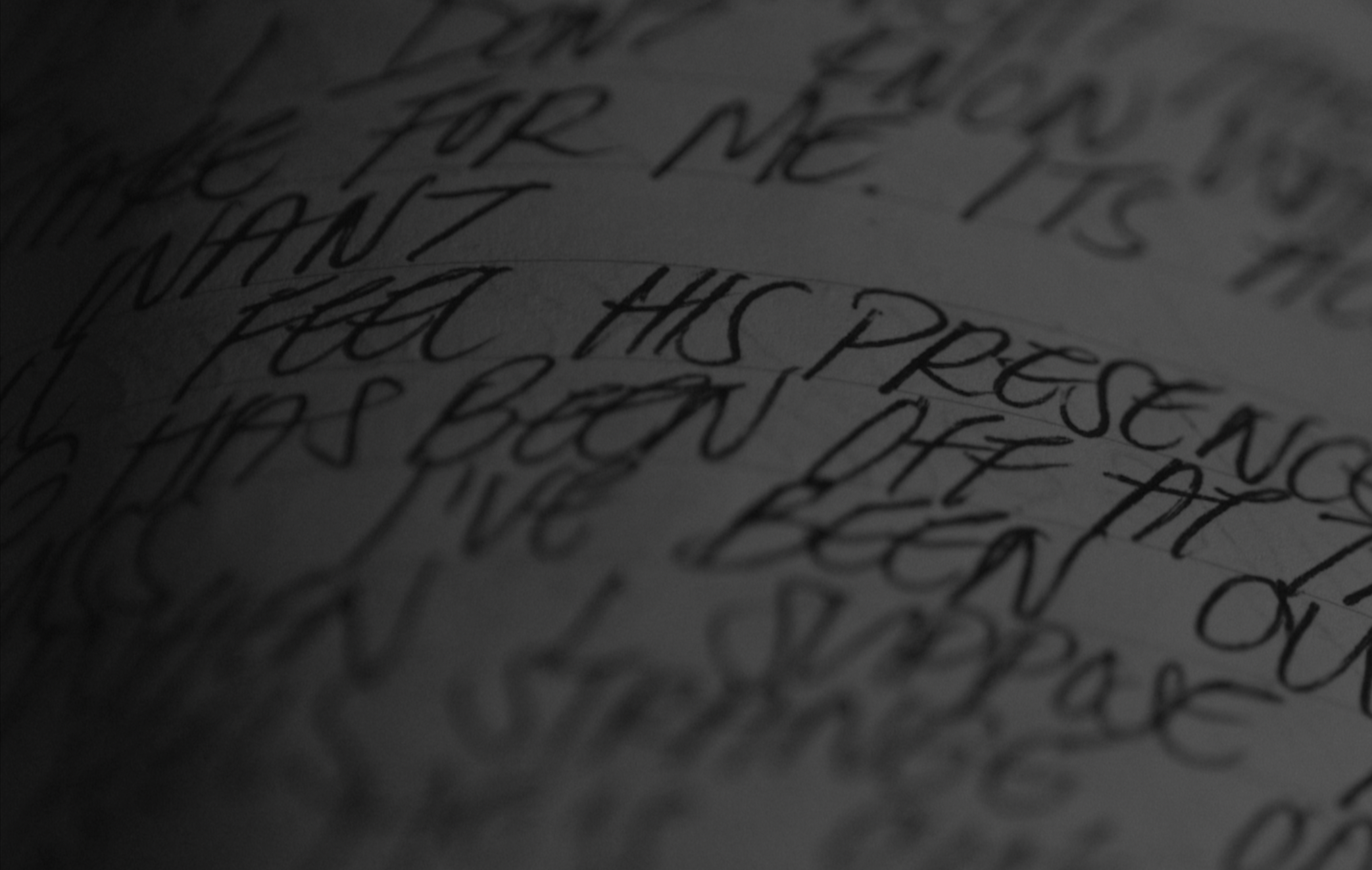
As a way to inspire creativity, and to maximize time with already rented equipment, Fish (2025) was a personal 48-hour challenge. Meaning, the cast & crew would be forced to write, shoot, and edit this film in just 48 hours. Thus, the writing process was intense, and yet, there is so much care placed into the message of the film, which ultimately makes Fish an incredibly unique project.
This thriller script was meant as an eco-conscious argument against over harvesting, specifically in the world of recreational hunting and fishing. The planet is dying, we’re losing resources, and we’re constantly at odds with one another. Yet, our ego, our pride, and our selfishness consistently keeps us stuck in the same dying era.
This script was challenging because of its complex subject. It took a lot of skill, determination, and understanding of the political and ecological landscape. However, that level of appreciation and commitment is what makes Fish an important, sobering story.
If interested in reading, contact for more information.

Designing the Poster (desig. 2025)
Fish (2025) is weird. That was a major focal point in its style, giving it an odd sense of identity, experience, and atmosphere.
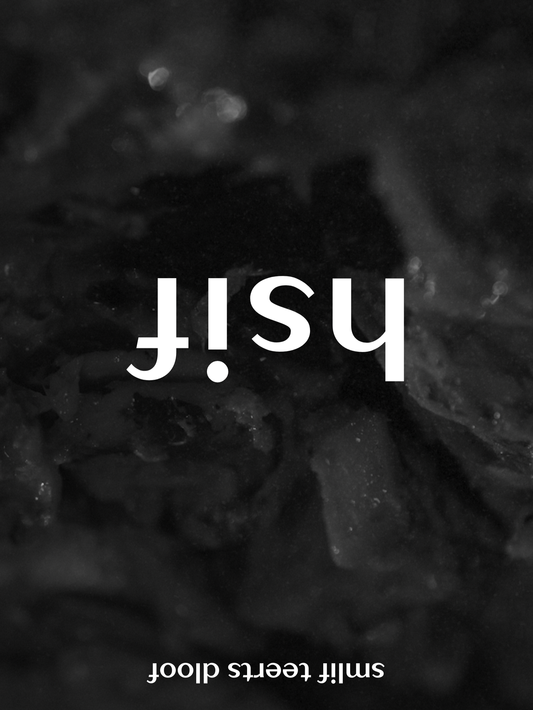
The story is disheartening, discombobulating, and, to be put simply, gross. The poster needed to reflect this, and every other attribute of the film that it could. This concept began with the background image, which is a disgusting, incomprehensible mash of mystery meat. Flipping this image upside down gave the poster an incredible look, while also representing the discombobulation the actual film achieves.
Furthermore, the title treatment receives much the same handling, but with a bit more care. Rather than flipping an entire text block upside down, it made more sense to flip each individual letter to preserve the actual title of the film, and to continue the same discombobulated, eery feeling. Same can be said about the decision to use an all-lowercase title, which gave the poster a creepy, unsettling, and even psychologically chilling, look.